Monday 31 May 2010

section view draft


This is the developed version of view 3 with a bit facade around and less perspective. I'll start to do the line drawing if this view is ok.

section view

Following the previous post for my section, I cut again through the stair.
Below are several views that I thought good. I felt a bit hard to choose the best for my section drawing.

1. Showing the route going up to 2nd floor mainly. I can explain my idea to let people walk through inside profile space. (This is the reason why I didn't connect 2 levels of profile as one).I can also describe more activities happened on the wide stairs.
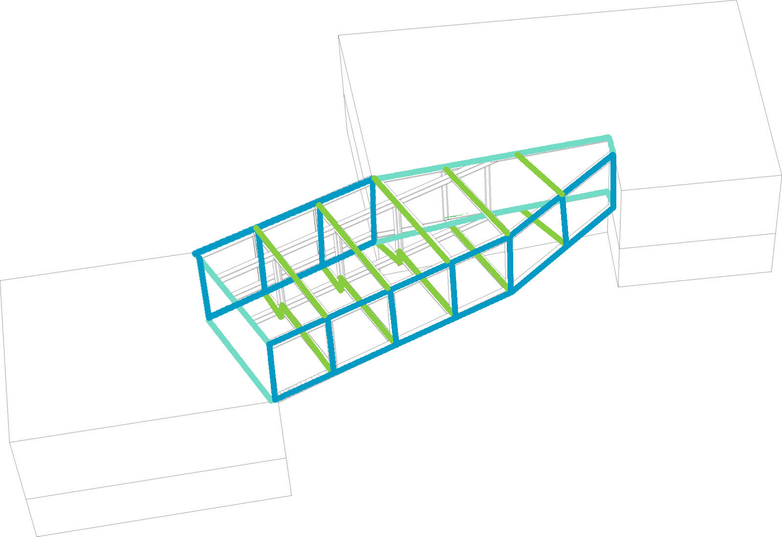
2. Same cut as the first one but viewing more from right front. Stronger sense of perspective view. The space for car to go at ground floor is clearer(it's the widest way between 2 profiles in the middle).

3.Cut from the other side to show the route connects Peter St. and Lexington St. This route goes up to 1st floor first to create a bridge to let car go through and then down back to ground floor.I think the horizontal void cutting pattern is better at this side and we can see a bit of the entrance from lexington side(right in the image). But the effect of the stair and the route is not as strong as the other two.

Section draft version


This is the draft version of my section drawing.
Is this view ok? Shall I zoom in more to the profiles? And any more detail should I add?

Since the curve of the circle is been distorted so much when I transfer my rhino file to illustrator, I sort of decide to make this drawing via laser cut machine with 1mm card board rather than print it out on paper. I can divide the drawing into several layers by spatial order, laser cut each and then assemble them together to achieve a raised effect.

Sunday 30 May 2010

Vierendeel Ruhong


Hi Ruhong you need to improve your structure a bit to make it work with your plans, the distinction between the main and secundairy structure is unclear.   
Here is a scetch of the strcuture as I see it keep us updated
simple collage for showing one view from courtyard glimpse into catwalk and bar. There is no material at the moment and pattern still need to be modified. This is just an idea of effects. I want the floor to be disappeared and now drawing detail section.
Thanks

beam plan

Black Box Model

Top one is the way how I will apply void to the Black Box.
The horizontal void cut for current model is following some ring shapes,I've tried to cut the black box following the same shape(as showed on top left). However the black box became too open that what's inside doesn't achieve as something mystery. Finally I decided only have too quite small cuts for the top surface, just to bring a bit light to the inside without showing too many structures.

The second image shows what people can see from each holes at 4 sides of the box. There are totally 8 viewing points --- 3 each at front/back and 1 each at sides. The height is been set up to the eye level which is about 1.5m from floor.

Becoming Habitat one of the series

^ This is the first of a series of drawings to illustrate the interior spaces of certain programs located within the block.

Friday 28 May 2010

Thursday 27 May 2010

Strategic overview diagrams...


The public space within the block...


Top two shoe the cavities of exhisting block (left) and the open space created (right)

Sunday 23 May 2010

100521 Final Crit

Many thanks to all of our critics: Dominic Papa- S333, Thomas Weaver- AA Files, Edgar Gonzalez- Brisac Gonzalez, Stephen Sinclair- Fourthspace, Marianne Mueller- Diploma 1, Cristina Díaz Moreno & Efrén García Grinda- Diploma 5/ Cero9/AMID and Brett Steele- Director AA School for all of their comments and input.


Jin uk discusses anamorphic principles with the panel


Jin uk's courtyard model


Antoine discusses stack bonding techniques with Edgar


The panel reflect on Manijeh's brick patterns


A catalogue of bonds


Cristina remarks on Zamri's Soho mimic


Efrén remarks on the fascination with making holes


Royce takes us through the changing identities within his spa

Thursday 20 May 2010

skin

^ Diagram showing the concept of applying a skin onto the interior space of the block.

Wednesday 19 May 2010

something for Antoine

Bremen Phiharmonic Hall by Daniel Libeskind


Strategy drawings

Alleluja, Alleluja, Alleluja!


Finally i'm done with the overall proposal. As usual it took me longer then expected but at least it's there. I'm now moving one to the strategic overview and section drawing. And tmr will built models.


The top one is a development from the bottom one to bring back the element of going from one side and shifting to another within the shop. Where ive highlighted blue (underneath the landing) on the 2nd drawing could be an entrance to the open kitchen where the Patisserie staffs could get in and out. And the strips do not go right up to the ceiling but merge into one surface.

I think i quite like how there could be the entrance underneath the stairs but may be it does look better when the strips continue right up to the ceiling (bottom one) . And may be add more strips to the landing part so the whole form looks more connected. Pls let me know what you think of the revised design.

Collage/section


A 'section' showing a part of the interior space in the block. I added both texture and advertisements to illustrate my idea of the pavement surface is used within the block, and the use of advertisements on the facade and the space used and the space used by the cafe.

Monday 17 May 2010

further scheme with foil/ pattern/case studies


this is the first trial of the applies previous achievements. i am keeping it broad so maybe it is going to becoming more simple and only using combination of 2 or 3 techniques finally.

thanks

Layering, Layering and Layering...

Here is a update of the proposal, i'm currently stackbounding the layers. Taking quite a long but hopefully will be done for tmr's tutorial. Once it will be done I will built some models. Since I would like the 1/200 to be a nice ending model (not a study one), i think i will do portion of the site at a 1/100 scale, as studies to improve after the 1/200. So the idea for friday would be to have several models and the strategic drawing and section far advanced. What do you think?

the interacted scheme


i did a quick collage of how the event users and existing users are interacted. the walls all own different properties(inspired from my pattern and material studies). it is just for make my head running and give a overall image of the situation for TS discussing. I am currently working on one typical wall and section for dimensions/material/fitting. and i am not very happy with where i place the mirror (i am thinking of applying mirror on sloped top of the catwalk so the inside images can be transfered outside to the courtyard but having problem of working out the fitting) and more importantly, i am a bit stuck with the roof for carwalk,,,,but think of finishing a physical sketch model after tomorrow then hopefully i will be more clear.

thanks

Initial rendering of the external view

This is an initial rendering for the external view from Peter Street, which is the entrance to my passage way. I finally plan to keep the facade frame and the structure columns of the existing car park. I think the idea to show the contrast between the old and new is very interesting as discussed in the previous crits.
The material of the perforate panels is been set up as steel metal, the entrance is kind of hidden by the pattern applied.

pt.2

At different perspectives the pattern changes. I tried to allow the pattern to create an inviting entrance at one point and when looked at perpendicularly the pattern creates this central focus point and draws people towards the interior to follow this pattern.

Sunday 16 May 2010

interacted program/wall scheme


this diagram shows the break through the street surface and the interaction with existing programs. i am integrate 3 different levels vertically: the courtyard-1.5m below building level, which forms the open theatre with glimpse into the bridge and direct view/ access with the bar, and large stairs(sitting)/ green space forms levels and distance to keep privacy between residential wall and ppl in the court yard. at the ground floor level0,0m, the entrance from archer st for fashion events with direct view into courtyard to transfer inside out. and from rupert st, the bar has been opened up to the courtyard allow movement through. and private entrance for models is next to the bar entrance and stairs up into main area. at the 1st floor level(3.0m), i am dealing with glimpse from street and bar into the make-up area. and hidden access from the bar to the auditorium at the back of vip seats. the bridge is running from lower starting from rupert street side and higher into the existing archer st. studio,

dazzle entrance idea#1


I adapted the dazzle pattern onto the entrance to create certain effects of the space within the entrance. When looking perpendicularly at the entrance we are drawn into this black central space. Also I played with distorting the perspective and the pattern is projected through the interior space behind the entrance which I find to be quite interesting and has some potential to be developed.
This is just a test and I will be designing a much more effective dazzle pattern on the three entrances of the building and maybe some of the interior spaces of the block.

Saturday 15 May 2010

preliminary skin sketch model +new ideas

the initial skin is a series of brick facets with openings (marked in blue) between facets to let light inside
in elevation, the facets peel away to create the openings much in the same way as the interior quetta bond peels away to create an intermediate space between the two layers of the wall


viewed frontally from carnaby street, one doesn't see the openings in the façade, only the facets that mask the perception of depth


viewed obliquely along beak street, the façade begins to open up and the depth of different facets can be understood (or not depending on the surface grain of the brick pattern for each facet) and the gaps between facets begin to be understood creating a more changeable experience of the surface like some of my foil models.

having built this model, I am starting to understand better the issues discussed at my tutorial of how the skin shouldn't be one element pasted onto the building but rather something that shifts between floors and overlaps to bring some of the interior vocabulary of the 'intermediate space' towards the façade.

My next step will be to model this new façade in 3d but do you think it is worth building another paper physical model or rather go back to exploring in section how the new façade can interact with the adjacent spaces and then make some decisions after that?

I think once I model the new façade in 3d and am happier with the nature of the spaces behind it, I could start to think about the brick pattern grain and how that can be unwrapped and rewrapped onto the façade - similar to the process used when making my foil models?

Internal Topographic Model

Here is a model with which I'm showing how the existing topographical changes are used and emphasized in the proposal. There are 4 blue layers representing each level of entrances in the department store, each entrance being attached to a street and its topography. (I know that the real highs are not as marked as on the model but the model is almost more diagramatic).

Thursday 13 May 2010


i am looking at the technique for profiles at the moment
Nottingham Contemporary Art Gallery
Caruso St John Architects

real time tracker
Dollar Car Rental Coupons